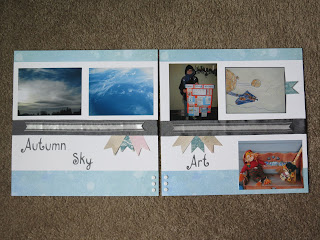
The next thing I did was to run some Basic Gray Two Tone Ribbon across both of my pages. This again added some interest and tied the two pages together. Adding banners became easy after that. I used the Hearts A Flutter Framelit to cut my banners out of Fan Fair Designer Series Paper (DSP). *Tip* You could cut them by hand if you don't want to pull out your Framelits. Then I tucked them under the Basic Gray ribbon. Next I decided to break up the gray a bit and added another ribbon. This time I used Whisper White Organza ribbon and cut each end into a flag tail.
The hardest part about the RHS was deciding what to call it. The layout is very similar with the ribbon, banner and papers. I arranged the pictures a bit differently. On the top is my son's school project and one of his drawings. On the bottom is a bench I painted 9 or 10 years ago, a broom I created who knows when, and the scarecrow my friend Angie W. made for me about 7 years ago. It's how I decorate my front porch each Fall. As October hits I add in pumpkins of various sizes as I pick them up at the store or pumpkin patch. Art seemed to fit.
In the close up you can see how I carried the banners, ribbon and even brads over to the RHS. Those brads are on clearance right now. I think I'll go pick up another set if they are still there. They are the PERFECT size for scrapbooking, and so easy to open! The letters are cut using my Cricut and Basic Gray cardstock. I made sure to use the same font for both pages.
This page really needed a journaling box, but I didn't want have a good place to put it. So, I hid it. I tucked it behind Michael's drawing and added a pull tab banner.
What started out as a mish-mash of pictures that didn't really go together turned out to be a pretty cute 2 page spread thanks to the design, paper and embellishments.
Now I want to see your banner page! Take the challenge and create a layout using banners, then let me know you did. They are a fun accent to most any page.
Creative Blessings,
Heather North
| Fan Fair DSP |
| Basic Gray Two Toned Ribbon |
| Whisper White Organza Ribbon |
| Hearts A Flutter Framelits |
| 5/16th" Neutral Brads Clearance Rack $1.59 |


2 comments:
Oooh, I love this idea of banners...being the pull tabs for the tags!
I too love the banner pull tab for the tag! Very clever Heather!
Post a Comment