3.12.2016

Sew Saturday | Sew Expo Recap


Sew Expo was very inspiring to me this year.  It was also overwhelming because of all the people & vendors. I feel like I barely scratched the surface of what was offered.  If you ever have a chance to attend one, I highly recommend it.  It's a great place for trying out new machines, tools, and furniture.  You might even spot a famous quilter or 2.  ;)  They also have several classes, but I didn't attend any.  By the time I was done going through the event center I was exhausted and still had an hour drive home.


Of course I took pictures of some of the quilts that inspired me in the different booths.  One of them was this American flag made with American Made Brand solid fabric.  I have a future "to-quilt" list filled with quilts I want to someday quilt and a flag is one of them. Check out that scrap rainbow rug too below the flag.  Color-fun!  A couple of my local quilt shops carry this brand and I really like it!  Lots of great colors, high quality and thick.  Not super thick, but not so sheer you can see through it either.  


Think pink!  Breast cancer has touched so many of us and the people we love.  I had to snap a picture of this quilt.  Making a ribbon quilt is on my "future to-quilt" list. 


This quilt above reminded me a bit of the one I made for my niece Meeka.  It has a 4 patch twist to it.  I think I could figure out the pattern just from the picture.
Meeka 4 months old
And because I cannot resist sharing another picture of my niece, let me pause for a commercial break to bring you a current picture of her as she discovers the joy of her own feet and rolling over.  <3

Back to the expo we go...


These modern Christmas trees made my heart smile!  I'm more of a contemporary quilter than a modern one, though I do belong to the modern quilt guild.  There are so many modern quilts that really jump out to me and I have to capture them.  The quilt below is another example of that.


This booth really captivated me and I meant to go back to buy a couple of things after I visited the ladies room, but never made it back.  There were too many people in there every time I walked by.  I did manage to get a few pictures though.  The picture below is a quilt I would like to make.


There is just something about bright rainbow quilts that get me every time.  Why haven't I made one yet?  That will be my goal for 2017.  Remind me in January, ok?  I already have enough goals set for 2016 to last me 3 years or I would put it on this year's goal list.  ;) 


I also took a picture of the tag, so I could find it later.   They were sold out of this pattern.  A picture of information you want to remember later is an excellent idea.


Here is another example of that concept.  They had some fabric here I really wanted to buy, but didn't want to fight the crowds.  They are (somewhat) local to me, so I took a picture of their business "card" and will go on a field trip to their store soon.  :)


As you probably saw in my post about this last month, it was a gorgeous day here in the Pacific Northwest.  Not at all like the typical day we are having today.  The mountain was out in all her glory and I thoroughly enjoyed seeing her pop up around every other curve on the drive home.

3.11.2016

Seattle at Twilight | Altenew Video Challenge #4


Friday is here!!!  My favorite day of the week.  Today I am playing along with a video challenge put out by Altenew.  You can read all the deets here.  I've been wanting to play with this stamp set since I first saw it used.   Funny thing is, I bought it before Christmas and haven't played with it until yesterday.  So glad this challenge inspired me to pull it out and give it some inky love.


Isn't a video challenge a fun idea for a company like altenew?  Now that my video is loaded I will be spending some time this afternoon seeing what amazing things others have linked up.  


This card could be embellished further with some wink of stella, white ink splatters, coloring in the space needle/windows/ferris wheel or by adding sequins, confetti, or enamel dots.  I still might add something to bling-it-up, but for now I like that fact that it is flat and easy to mail.


If you are looking for more inspiration for stamps like this, or this color palette, check out the In The Mood class by Creativity Grows Here.  It's still one of my favorite classes for inspiration when it comes to design and color.


Stamps: Sketchy Cities America 2 (Altenew)
Ink: Dusty Concord, Mermaid Lagoon, Seedless Preserves, Wilted Violet (Distress) Versamark
Paper: Distress Watercolor (Tim Holtz/Ranger) Basic Black, Whisper White (Stampin' Up)
Accessories: Stitched Labels 1 (Pretty Pink Posh) Falling Snow Stencil (Simon Says Stamp) Clear & White Embossing Powders (SU) MISTI (My Sweet Petunia)


3.09.2016

Painted Butterflies | Sneak Peek | Formula 123

We have a not-so-secret formula for our challenge this week.  The formula is to use 1 Sentiment 2 Layers and 3 Words.   Here is a sneak peek of my card.


Clicky to head to the challenge forum to see what the rest of the design team did for the Formula 1-2-3 challenge and then be sure to play along with us.  Not yet a member?  Sign up now at http://catherinepooler.com/sntop

Stamps: Painted Butterflies (Altenew) Strictly Sentiments 4 (Wplus9)
Ink: Blushing Bride, So Saffron, Wisteria Wonder (SU) Tuxedo Black (Memento) 036, 206 (Zig Clean Color Real Brush Marker)
Paper: Bristol Watercolor; Pink Pirouette (SU)
Accessories: Blueprints 20 (My Favorite Things) Gold Sequins (Pretty Pink Posh)


3.07.2016

Masculine Monday ~ Birthday Brother

Confession Time 

I have a weakness for patterned paper.  If you were to look in my craft room it would be obvious immediately.  The only problem I have with this is that I rarely use patterened paper on my cards anymore and it is even more rare that I scrapbook these days.  This card doesn't put a dent in my stash, but it did get me looking through my patterned paper again, and that is a start.


The bonus is that using patterned paper meant this card for my brother came together super quick!  I cut a panel for the front of the card, then cut a 1"strip in contrasting paper.  Finally I cut a designer rectangle out of a 3rd piece of  paper. To add the finishing touch that gives it a more professional look I lightly sponged the edges of my sentiment panel and vertical strip.  This toned done the white edges from cutting.  My card was done, but it needed a little somethin' somethin' so I added a scattering of neutral candy dots.

When was the last time you pulled out your pretty paper and used it?  I challenge you to dig around your stash and use some patterned paper on a project this week.

Stamps: Young At Heart (CAS-ual Fridays Stamps for SOA)
Ink: Black (Hero Arts) Crumb Cake (Stampin' Up)
Paper: Sahara Sand (SU) Stationer's Desk (Prima)
Accessories: Candy Dots: Nuetrals, Sponge (SU)


3.05.2016

Sew Saturday | OMG Challenge | March Goal

It's time to set a new monthly goal.  What I really wanted to do was work on my grandmother's quilt, but it's a new project.  I've been doing A Lovely Year of Finishes for so long, that I've been making my goals be items that have sat for awhile and need to get done.  It dawned on me though, that I am doing a new challenge this year, One Monthly Goal.  It's about making a goal each month and seeing it through, so Grandma's quilt is back on the table.  (Thank you, Heidi!)

RedLetterQuilts

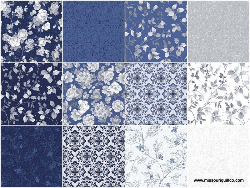
Grandma wanted a blue quilt so I chose Charlotte by Kensington Studios.


I've cut out all the orange peels and now I need to add interfacing and attach them to their white blocks.  I haven't yet decided whether I am going to sew the blocks on by machine or hand.  If I do it by machine I just might be able to get the quilt finished this month and give it to my grandma when I go down to see her.  If I do it by hand it means more time spent loving working on a quilt for her.  Either way, my March goal is get all the orange peels attached to their white blocks.


The cool thing about this is that last night my husband and both my sons came into my sewing room to talk and all 3 of them made comments about this cool new design.  It might be the first curved piecing they've ever seen me do.  My husband even said this was his favorite design he's seen so far.  He just might get a quilt in this pattern too, if the process for grandma's quilt goes well.  So far so good. 


What are your sewing goals for March?  Be sure to link up with OMG and share them with all of us.

3.04.2016

Happy Hello Life | Faded Distress Stencil Technique | Video

Hello, Friday!  Where have you been all week?  Friday truly is my favorite day of the week. It holds all of the promise of the weekend without having burned any of it up.  Since I work from home, I try to make Friday my creative day.  Today I will be working on some sewing of my grandma's quilt.  What are your plans for the weekend?


My card for today was inspired by my last official challenge as a design team member of Stampin' Celebration. Check out my last card as a design team member here if you missed it.   I stepped down from that challenge earlier this month first, to give others a chance to join the team and second, to step out of my comfort zone.  As long as I was a member of 2 design teams I didn't feel the push to look for another one.   


Now I am on the hunt for new design teams. Stretching ourselves as cardmakers is always good.  Have you heard of any design team calls lately?  CAS-ual Fridays is having one and Saturday, March 5th is the last day to send in your application.


 I filmed a video for this card, but I am battling allergies so I think I sound really funny.  Hopefully you will still find a tip or two to inspire you in your creativity.


***Note: The stencil I used is now sold old and won't be available for at least 6 months.  You could easily substitute with one of the stencils in the Happy Patterns collection from SU, or search your favorite brand for something similar.

Stamps: Hello Life (Stampin' Up)
Ink: Pink Pirouette, Melon Mambo, Night of Navy (Stampin' Up)
Paper: Whisper White (SU)
Accessories: Harleen Stencil (Winnie & Walter for SOA) Mini Ink Blending Tool (Ranger) Blueprints 24 (My Favorite Things) It's My Party Enamel Dots (SU) Wink of Stella, Glossy Accents
Hello Life
It's My Party Enamel Dots by Stampin' Up!
It's My Party Enamel Dots


3.03.2016

Happy Birthday with Colour Q and Just Add Ink

I was scrolling through Facebook yesterday and saw this fabulous card made by Tracey McNeely for the Colour Q challenge.  I absolutely love what she did with her background and the colors she chose, so I had to play with the color combo myself.  It's a very soothing combination that works well for masculine cards.


I didn't have a couple of these colors, so I used the next closest ones.  I already had a stamp set and sketch in mind because I wanted to play along with the JUST add INK's 300th sketch challenge!!!

JAI #300

My card doesn't come close to some of the amazing design team samples, but I sure had fun!  It was completely accidental that I used so many Sale-A-Bration items on this card.  I just kept pulling things out that I thought would work for these 2 challenges.  :)  Now you know how much I spent with my last SU order.  lol.


  I'm already thinking ahead and planning to make something similar to this card for Father's Day.


Stamps: Perfect Pairings (SAB), Sky is the Limit (SAB), Timeless Textures (Stampin' Up!)
Ink: Bermuda Bay, Island Indigo, Smoky Slate (SU)
Paper: Island Indigo, Perfect Pairings DSP (SAB), Smoky Slate, Whisper White (SU)
Accessories: Grey and White Twine

3.02.2016

Brighter Days in Black or White

This week's challenge at StampNation had the design team in a tizzy.  Why?  I challenged everyone to choose between black & white.  They could use one color but not the other.  Many of us use white card bases and black ink.  It was a stretch to go without one of them, but the design team pushed through and came out with some amazing-ness to inspire you.  Here's a sneak peek of my card.


In the picture it looks like I broke the rules, but in reality I used a dark purple for my contrast.  :)  The funniest thing about this challenge is that I didn't mean for it to be difficult.  When I started stamping, I rarely used black ink and I used colorful cardstock for my base instead of white.  I thought it might be fun to go back to that.  Apparently it is hard to get out of a deep groove.  lol
I hope you will join in the challenge.  StampNation members can view the challenge here clicky.  If you are not a member and are interested in learning more CLICKY


Stamps: April Showers (Clearly Besotted) Young at Heart (CAS-ual Fridays for SOA) 
Ink: Dusty Concord, Salty Ocean, Seedless Preserves (Distress) Pacific Point, Perfect Plum (Stampin' Up) Versamark
Paper: Perfect Plum, Whisper White (SU) Distress Watercolor (Tim Holtz)
Accessories: Birthday Journal Tag (Sugar Pea Designs for SOA) Metallic Platinum Sparkle Embossing Powder (WOW) Twinkle Dots (Queen & Co.) Purple & White Twine